Showing posts with label Research. Show all posts

Saturday, 18 December 2010

Photography for Ancillary Tasks

For our ancillary tasks we wanted out villain to be the main focus, especially in the poster. We felt it was more effective to use a scary image to persuade our target audience to see the film. Whilst filming for our teaser trailer we were able to take photos of our villain in the dark, which was an appropriate background.

This was one of the many photos we took with a possibility of being used for our poster or website. The expression on her face could be quite intimidating and scary with the right editing. She is looking directly at the camera and therefor at the audience.

These two photos were edited from the original above. The reason for using red and green was to signify different codes and conventions of a horror film. The red one uses the three gothic colours, red, black and white, and represents blood, murder and is a typical convention of a horror film.
However, the green picture represents our super natural sub-genre and well as jealousy which is part of our narrative.
After consideration, we decided that these pictures faded into the background too much and didnt stand out as much as they should do for a poster, however the angle and expression of the face it really interesting and works well for either a poster of as an image for  a website.
This was our final edit of this particular photo and found that is was far more effective than the others. The features of the face are far more defined, it uses the three gothic colours again and the pale white skin and dark eyes help the face stand out. The character looks more intimidating and scary.

Sunday, 21 November 2010

Typography for our film title


http://www.searchfreefonts.com So far we have created our typography individually using our own software - For a change I researched font styles which would suit our particular genre of supernatural horror and revenge. The results show a great diversity between fonts and the impact it may have on the audience. In particular, I think that the most effective font style for our narrative our those which look handwritten. They could create an unsettling atmosphere along with the combined efforts of the background and imagery on the poster.

Sunday, 31 October 2010

Genre Theory

The principle characteristics of genre:
  • Genre’s overlap, with boundaries transcended 
  •  Hybridity (a mix of genres)
These can be followed or subverted!

Nicholas Abercrombie
  • States that now and in the future, genres and more ‘permeable and looser’.
  • Semiotics - a frame for the watching experience –the expectations of genre are so fixed through the use of codes and conventions.
In our teaser trailer, we shall follow the use of codes and conventions. Throughout our promotional package, we aim to give the audience a taste of the genre and narrative, hence intriguing them into watching the film and wanting to know more about the film and production. Through the combinations of colour schemes, font styles, diagetic and non-diagetic sound we want to produce an atmosphere of fear and the unknown, leaving the audience wanting to see more and experience the excitement of the horror film.

Todorov and Hirsch
  • Looks at the textual structure of film.
  • Scientific approaches – encourages interaction and involvement
  • Single genres – structural approach – canon for a genre
  • Transhistorical – a continuation of literature and a reincarnation of myth.
  • Transitional – A dynamic paradigm (predictable development) Adopts to trend, culture, history, politics, technology etc.
Our film is more likely to have a structural approach and express single genre. We chose supernatural horror so we could portray a sense of uneasiness and vengeance through make-up, lighting and careful editing. In our teaser trailer, we are going to show the audience a glimpse of the main characters and the fact that a young woman is being haunted and is the victim. Our purpose is to create an impact on the audience and leave them questioning. To create our film to fit the horror genre; the teaser trailer will have fast paced transitions, eerie non-diagetic music, emotive close ups and the simple, emotionless stance of the dead girl. Each genre follows specific styles in camera angles, sound, mise en scene and editing.

Legality and websites


The more successful a film is, the more likely that fans would want to buy products which provide more information about the film; for example, interviews with cast, character profiles and merchandise. It is certain that companies do not just make money by selling DVD's - due to the developing nature of the media and easy access to the internet, websites are necessary for promotion and success.

There are certain requirements which websites have to follow and abide by the rules - this applies when the company advertises a product, has an online magazine and sells products.
  • E-commerce and distance selling regulations may apply even if you are only using your website for promotion and not to actually sell products or services online – need to provide information about the business. 
  • Data protection regulations apply if you are collecting information from your visitors through online forms, by e-mail or telephone – this is crucial when fans interact on the website in competitions, purchasing merchandise etc.
  • Trade descriptions - If you are describing your goods or services online then your descriptions must be accurate and not misleading.
  • Access for users with disabilities is an important issue, and parts of the Disability Discrimination Act of 2004 may affect websites – need to take in consideration to have a user-friendly website, with clear font style, size and colour with simple links.
  • Intellectual property rights - have rights regarding the information that you publish on your site through international copyright laws. Cannot infringe anyone else’s rights – therefore will need permission to use other people's logos, images or text before you include them in your site. 
  • The EU 'Anti-spam' laws - the 'Privacy and Electronic Communications (EC Directive) Regulations 2003' only relate to web sites if 'Cookies' are used to track visitor behaviour. You have to tell users that you are using cookies, explain why and show them how to switch them off.


Websites

Websites are designed to advertise a product, and they are essential when promoting recently released films.
They are judged in 5 categories:

Functionality
  • Access - how easy it is to get what you want?
  • Speed - how compact is your web design?
  • Legality - Copyright and law-awareness of boundaries
Design
  • Typography - font styles and the range of fonts for different information
  • Artistry - needs to suggest the genre
  • User friendliness - the ease of use, simple and straightforward links
  • Clarity - easily read and followed
  • Aesthetics - colour harmonies and relations to genre of film
Content
  • Purpose - freebies, merchandise etc.
  • Fan base - link to downloads and memorabilia
  • Information process - need synopses to link to film and give people a taste of the film to come
  • Verbal expression - quality of grammar
  • Attention to detail - create a unified, not dysfunctional website, where the sound links don't sound intrusive
Originality
  • Quality of predictive research - find out what people like from existing websites
Overall effectiveness
  • Where the strengths lie
We were able to expand this and find out what our media class thought about existing websites - the strengths and weaknesses:

Strengths
  • Search box
  • Clear headings and links
  • Special visual effects
  • Colour which relates to the genre
  • Connotations and links to genre through imagery and animation
  • A user friendly page
Weaknesses
  • Blocked links
  • No imagery
  • Not user friendly
  • Pop-ups
  • When the trailer starts automatically
  • An introduction
  • Advertisements
  • Sounds from other websites
  • Not enough links - specifically a 'home' link
  • The design doesn't fit on to a computer screen, which requires the user to scroll horizontally.

Wednesday, 20 October 2010

Saw 6 - Website Analysis

As you first open the website, an image appears as the website loads. This is effective as it intrigues the viewer, and doesn't allow them to become bored of waiting and leave the webpage. This would be something we could use on our website. The black background clearly highlights the image and text used. These are placed directly in the middle of the webpage, as this is where the viewers eye falls.
This is the main page for the website. It is effective as the trailer is playing, with an option to turn audio off. As it plays automatically there is no option for the user to play it. On our website, we would prefer the user to be able to choose whether to play the trailer or not. There are no links to other pages on the website, and you have to scroll down to look at the rest of the page (with links to facebook, and links to the official store etc)

Tuesday, 12 October 2010

Typography in posters

The poster of ‘When a Stranger calls’ have opted for a simple style of typography, ensuring that it is clear for the audience.


The colour scheme of the title follows the colours shown in the imagery, with the colour being drained from the text the further away it is from the imagery, creating a faded effect. Compared to other horror films, yellow is a prominent colour, with its purpose to highlight the darkness of the film and portray an unsettling narrative.

The title is positioned in the top, centre of the poster, where the eye naturally settles on the page. It is emphasized due to the use of a stark black background.

It is a not typical of a horror film, but the emotionless typography with serif font brings a sense of the unknown, consequently intriguing the audience.


The font used for ‘disturbia’ resembles type-writer font, as it is simple and clear.

The colour of the typography is white, and is emphasized by the black background. The use of a black and white background means that the audience is immediately drawn to the coloured imagery.

The tag line used is in very small font, forcing the audience to try and make out what it says, focusing strongly on the poster. In addition, the title and the tag line have the same font style, with purpose to relate to the film.

The style of font is also emotionless – where by the audience is not able to grasp the horror genre by the title. Due to its simplicity, it leaves a sense of the unknown, leaving the audience questioning.

In this poster, the imagery is a stronger persuasive technique than the title – due to the titles size and positioning. It is positioned just below the image, and stands out, making it clear for the audience.

Typography Examples

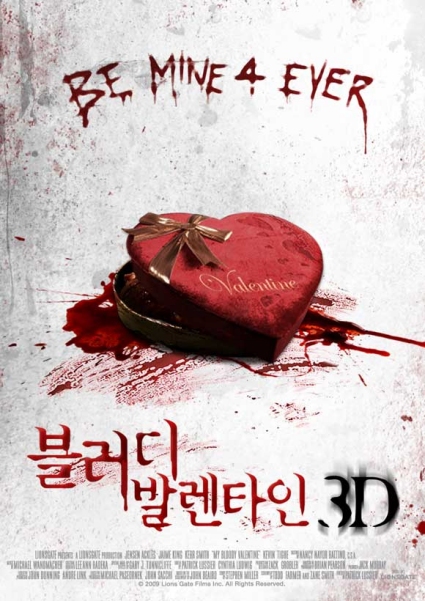
This text looks like its written in blood, but also has a scratchy style to the lettering. The number “4” could relate to a younger target audience, as it is "text" language. The red colour represents blood, death etc but is also challenged by the image of a heart as it represents romance, but has blood underneath. It also says valentine on the heart (box of chocolates) The audience quite a lot of narrative from the poster, could possibly be obsession. Also the language used at the bottom creates intrigue, but is written in the same way as the title.


Although this doesn't fit the genre of our teaser trailer, the typography used is interesting. The title is very clear and simple to read. It is also the first thing that the eye is drawn towards, and it is in the golden section. The colour of the typography changes through the word depending, and contrasting with the background. The black and white colouring could repestent conflict between the characters. The woman standing in the back is wearing a red dress, which comes with all the connotations of being seductive, promiscuous, and sexually dominant, and could be the character to be feared or disliked in the film.
We really like this example of typography, as the lettering and whole words are still very clear and easy to read, but also has a hidden message. When you look closely, the audience can see that the shape of a corner of a shower is shown in the lettering, and as it gets closer to the bottom the amount of red blood increases.  It uses the 3 gothic colours, red white and black. At the beginning the audience are attracted to the blood at the bottom, but they have to really focus to see what it is, which creates intrigue about the event.
All of these examples of typography could influence our decisions made when creating our typography.

Typography Inspiration

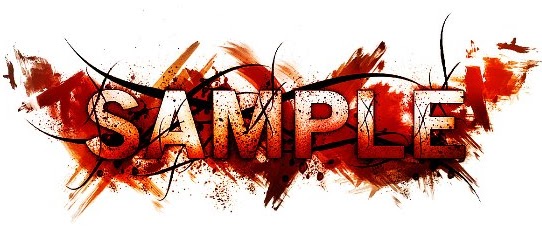
 We have started to analysis different typography styles to help us decide what typography we can use for our poster, film magazine cover or website. These are a few examples we found that are quite interesting. The first one we thought could represent our horror film well, it used the three main gothic-horror colours, red white and black. The lettering appears to be on smeared blood, which represents danger, threat, murder, etc. The black lines around the lettering could represent sharp objects such as barbed wire. Eventhough there is a lot of imagery in this style of typography, the word 'sample' is still visable and can be clearly read.

This is the second style of typography we looked at. The lettering is very clear and the bright UV-like colours make it quite eye-catching. However we thought this style wouldn't work as well as the one before because it doesnt represent our particular genre. But the water marks around the lettering create an interestinf effect and we could possibly use this idea and use red to represent blood, danger, threat, etc.

Monday, 11 October 2010

Anchorage Ideas

After analyising 'The Grudge' poster and website we looked at the trailer for different anchorage ideas and how to transmit titles into our teaser trailer.


Theses were the first title in The Grudge trailer, it is transmitted through the the visual effects on the screen, it's in the style of the villains hair being whipped across the screen, and this is one of the character's key features. Each letter uses the same affect at a slow pace so the audience has time to read the title.
The whole title isn't visable for the same amount of time, and gripping words have been used such as 'dies' and 'powerful Rage', this gives the audience more information about the narrative.

The second title 'a CURSE is left behind' uses emotive language which creates fear amoung the audience as well as intrigue. By using black anchorage on a white/blue background creates contrasting connotations and mystery which relates to this film being a 'supernatural horror'.

The Next Two Titles:

it never forgives

it never forgets

THE GRUDGE

These next few titles name the villain as 'it' which suggests to the audience that this 'thing' isn't human. The last title is capitalised just to indicate the name of the film and create a dramatic impact. Overal the anchorage used in this particulat trailer has used the same font, size, colour and the same transmissions.

The Grudge - Website Analysis

As you first click on The Grudge website, this title screen appears, with the DVD cover on show. The links down the side of the page allow you to "Enter the site" or visit other pages such as the "Trailers and Clips". There is also a link which allows the visitor to read a little about the "Synopsis". All of these links are easily accessible and user friendly.
The colours used are colours typically associated with horror, with a black background and red text colour. The lighting used in the photo suggests a dark side to the film.


As the user clicks on "Enter the Site", the full website launches and an intro to the film beins. The screen is completely black, and images appear with flashes (similar to camera flashes) along with text to introduce the storyline of the film.

Following the intro, the interaction with the viewer continues, as they put in their name and initials.

There is very little information on the screen. The use of a completely black screen with a focal point makes it very clear, and is very effective in conveying the genre and general theme of the film.

Following this, the user is then introduced to a game, and given instructions to complete a game.  They are presented with a photo, and have to choose the correct place to go by clicking. This website is very interactive with the user, and allows the user to have a real insight to the film.

The Orphan Stills

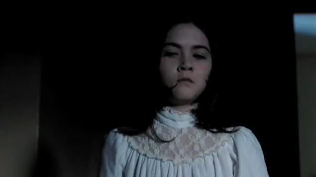
The Orphan is a horror film which uses a young girl as the villain. We thought this particular character was similar to ours.
Her image in this still from the trailer has conflicting connotations. Her white dress indicates innocence and purity however the lighting and her dark features challenge this interpretation. Her facial expression threatens the audience and creates fear as well as intrigue.
We've used simular mise en scene to this for our main character in our teaser trailer to convey the same ideas. We have dressed our character in a white dress which can be perceived as nightwear like in this still.


This still enhances Esther's perceived vulnerability while the distance look on her face creates suspense. We have used a simular location to this in our teaser trailer because it represents a childlike quality and this iw what we wanted to create. Her outfit contrasts with the surroundings and this makes her the focal point in the shot.

In both of these stills, Esther has been deliberately placed in the rule of thirds rather than directly in the middle.

Wednesday, 6 October 2010

POSTERS

The Golden Section
  • Is where the audience’s eyes eventually settle. It could be tactical to go against this idea as it may confuse the audience and make them think.                                                  
  • Posters which follow this rule often follow other tactics. For example – ‘Alien’ uses tricks of composition. Has a large V layout with small writing, making the audience focus strongly on the text.
Colour
  • Colour is used deliberately to suit the narrative of the film, for instance red is commonly used in horror films (more commonly slasher) due to the connotations of blood and death. Whereas white signifies that there is nothing there, which leaves to the imagination. White is also used in horror films as it brings a sense of the unknown and can be unsettling.
  • A vast majority of horror films follow the common colour scheme: black, white and red – a gothic style. This can be particularly effective as the colour red will stand up amongst the colourless background, bringing the eye to this point of the poster. For example, ‘The Omen’ eliminated all white in the poster as it interferes with the overwhelming sense of red – as a result the poster is imposing and intimidating.
Imagery


  • Imagery is a necessary tool used to draw the audience to the title of the film, more commonly when the poster does not follow the Golden Section. This allows the audience to wander the poster, seeing important information which may not be obvious to the eye.

Friday, 1 October 2010

The Last House on the Left - Sound

A Sound analysis of The Last House on the Left trailer 2009.
http://www.youtube.com/watch?v=sl2lmFPBGN8
  • The trailer is introduced with a light-hearted, high pitched, fast paced tone - which is parallel to the imagery ( a friendly road trip).
  • The dialogue immediately informs the audience of the storyline and the purpose of their visit - 'Meet up with Page' etc. We are introduced to the main characters of the film and the relationships between the characters.
  • The female characters are laughing, creating a happy, relaxed atmosphere; however a sudden low pitched sound stab shows a direct contrast.
  • The non-diagetic sound remains parallel - high and low tones blend together to create an eerie sound.
  • The dialogue informs the audience of the narrative of the film - we recognise that the characters are in the wrong place and are confronted by unwanted guests. When men are shouting in an aggressive tone, it builds the climax and signals distress.
  • The diagetic sound of a knife blade is intimidating and threatening towards the female characters.
  • A sudden sound stab as the black screen is introduced.
  • As the tempo increases, light drumming is introduced - diagetic screaming, shouting and banging on doors - signals to the audience that the characters can't escape. This is a tactic to build tension.
  • A gun-shot brings sudden panic amongst the audience - fear of death and danger.
  • As the tempo increases, there are faster, punchy transitions between shots, accompanied with a non-diagetic low pitched banging sound.
  • The diagetic sound of rain and wind - weather conditions usually associated with the horror genre.
  • Following the climax of the trailer, a non-diagetic melody is introduced - a missing character appears. The soundtrack has lyrics, 'Sweet child of mine..' which could portray how protective the parents are over their daughter.
  • Men scream and shout - are represented as the inferior in this situation.
  • The climax continues with fast-paced transitions. The low, disturbing non-diagetic sound stops whilst the melody continues into the title of the film.

Wednesday, 29 September 2010

The Exorcism of Emily Rose: Sound

A sound analysis of the first 3 minutes of The Exorcism of Emily Rose.
http://www.youtube.com/watch?v=mVTgk8KEyV0
Throughout titles:

  • A strong, low monotone at a slow pace.
  • A high tone is introduced creating a blend of eerie tones and raising uncertainty amongst the audience.
  • The non-diagetic sound is parallel to the narrative - unsettling and hinting the horror genre.
Black Screen:
  • The non-diagetic sound continues.
  • Diagetic sound is also introduced overlapping the soundtrack - Although not entirely clear what these sounds were, it sounded like wind, animals, screams or someone in pain. 
  • Is use of dialogue when a female character screams 'Emily?!' - hints danger, pain, distress and lack of power. It specifically intrigues the audience. It seems from the diagetic sound that there is a female protagonist - a stereotypical role of a female in horror film (what is expected ).
Fades to white screen, then imagery is introduced:
  • As the title of the film is shown, the screaming stops. Meanwhile the low monotones of the non-diagetic soundtrack are still present.
  • Diagetic sounds of howling wind, the rustling of crops and footsteps highlight the silence surrounding the old, male character. It portrays isolation and emphasizes how alone the character is - not safe.
  • As the film proceeds, the high non-diagetic tones remain, however when a character feels uneasy, the low tones are re-introduced.
  • The sounds of object which are affected by the wind create squeaking, unsettling noises.
  • In addition the sound of small animals and wasps hiding for safety indicates a sign of danger. This has raised the tension, and the audience now expects a climax to take place.
  • Conversation only starts when the film reaches 3:00 minutes approx, demonstrating that the film has successfully built tension using imagery and sound, showing the audience of the specific codes and conventions of the horror genre.

Friday, 24 September 2010

Locations - Houses

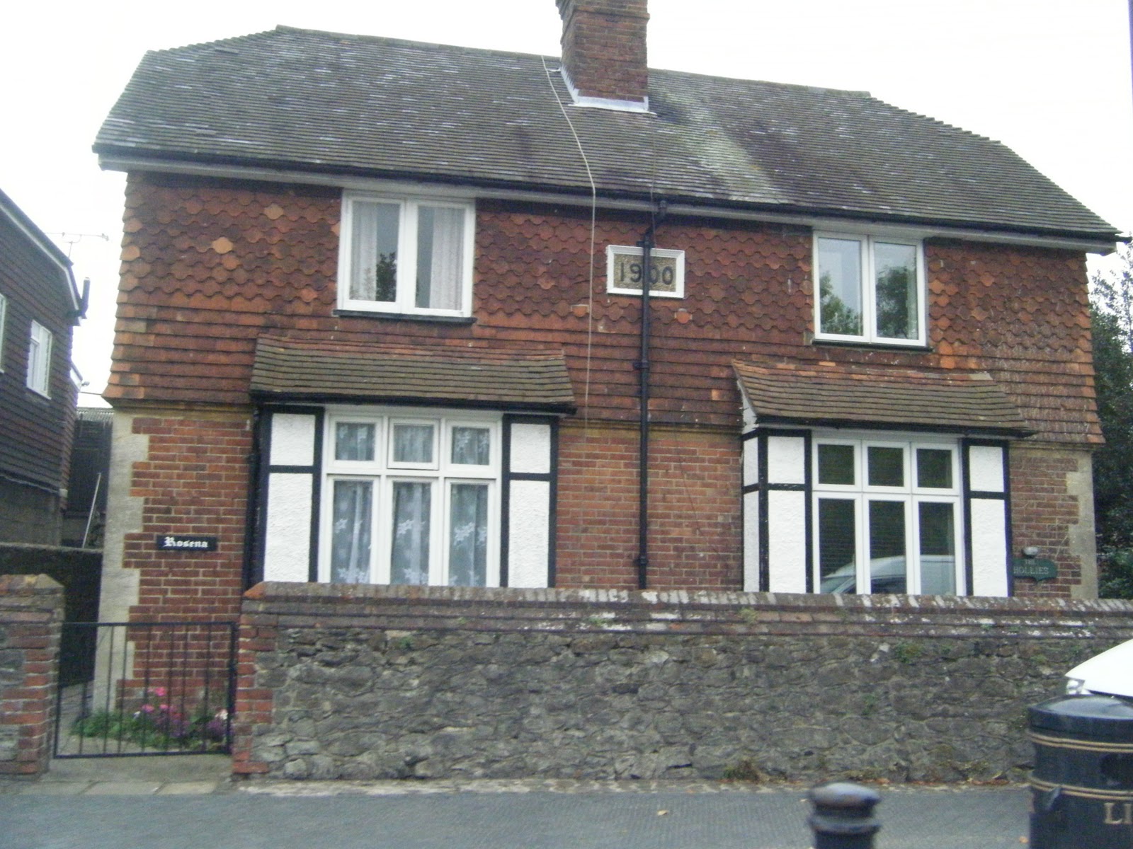
These are photos are possible locations for houses we could use in our trailer. We want to have a flash of eerie-looking houses to portray the horror genre, and show a variety of locations in our narrative.


Thursday, 23 September 2010

Writing on the Mirror


This was a first attempt at writing on a mirror in lipstick. We tested this to ensure that the lipstick could be easily removed from the mirror, and that is has the desired effect.

Filming the mirror could cause a problem, as nothing can be shown in the mirror, and over the many shots of the mirror we do, nothing can move in the reflection.To do this, we may have to film at an angle, which could show the lipstick, and the reflection of the writing in the shot, making it look as though there are two layers of writing. We can avoid this with the angle we film at.

Possible Location

This could be used as a possible location, as it seems isolated, and is spacious to allow different shots to be taken. One of our ideas is to have a long shot of Jodie, nearer the end of the lane; and have sudden images of her coming closer to the camera - this will be intimdating and unsettling for the audience.

Tuesday, 21 September 2010

Makeup

After experimenting with makeup we decided on the particular look for our supernatural killer. Firstly we used white as a basecolour for her face, this was applied quite lightly so we can still see some of her natural skin tone. This created a ghostly look which worked really well because it will create fear among the audience. Secondly, we created dark shadows under her eyes using black and green colours, to make her look gaunt and ill. This was also inspiration from the villain in 'The Grudge'. We used green as well to create the idea that she's been underwater, its creates unease for the audience as well as intimidation. We then created shadows around her nose and mouth to enhance her features and add colour.

The Dark Knight - magazine covers

Empire produced many different magazine covers for the release of the film "The Dark Knight". These are two of them that show the main characters.
These magazine covers are a good example of adapting the cover depending on the theme and type of character, and links to the characters to enable the audience to connect.
The two covers have different colour schemes, but both keep the same layout and titles, so that the two can be recognised as linked to eachother.
With most other magazine covers, the photo of the character covers some of the title. However, here, the text is brought to the front and the image to the back to highlight the title, the fact that there are two covers to collect, and the film title. This is effective as it is may not be what the audience expect from a magazine cover.