The first screen from the Quarantine website has a link to buy the DVD and Blu-Ray. The image in the background is of the main character looking scared, edited to seem as if it has been captured through CCTV footage, which reflects the general nature of the film. The trailer takes up a significant portion of the screen, which will immediately draw people's attention to it. It plays automatically which increases the ease of use. There are links to photos, a game and a blog, among other things, which caters for everyone's interests.
The loading page for the website is the footage from the last clip in the trailer, played on a loop. This keeps the audiences attention and is much more interesting than just a black screen with a loading bar at the bottom. Once the page has loaded, the woman is dragged away and this is designed to shock people and to give an insight into the tense and scary nature of the film. For our own website, we are interested in playing an animation, because it will allow the audience to gain an insight into the genre and themes of our film, and offers a more interesting way to wait.
Once onto the main site, link options are displayed as soon as the mouse hovers over different sections. These include; video, gallery, game, about the movie, promotions, downloads and social networking. These links are set on the backdrop of the profile image of an apartment complex, which is where the film is set. The image itself is creepy, with the inclusion of flickering lights and fuzzy TV screens. The idea of hovering over something for it to appear is quite interesting and would be good to include, but it should be made obvious where to look for the different options, or it will decrease the ease of use.
Showing posts with label Analysis. Show all posts
Wednesday, 3 November 2010
Tuesday, 12 October 2010
Typography in posters
The colour scheme of the title follows the colours shown in the imagery, with the colour being drained from the text the further away it is from the imagery, creating a faded effect. Compared to other horror films, yellow is a prominent colour, with its purpose to highlight the darkness of the film and portray an unsettling narrative.
The title is positioned in the top, centre of the poster, where the eye naturally settles on the page. It is emphasized due to the use of a stark black background.
It is a not typical of a horror film, but the emotionless typography with serif font brings a sense of the unknown, consequently intriguing the audience.
The colour of the typography is white, and is emphasized by the black background. The use of a black and white background means that the audience is immediately drawn to the coloured imagery.
The tag line used is in very small font, forcing the audience to try and make out what it says, focusing strongly on the poster. In addition, the title and the tag line have the same font style, with purpose to relate to the film.
The style of font is also emotionless – where by the audience is not able to grasp the horror genre by the title. Due to its simplicity, it leaves a sense of the unknown, leaving the audience questioning.
In this poster, the imagery is a stronger persuasive technique than the title – due to the titles size and positioning. It is positioned just below the image, and stands out, making it clear for the audience.
Typography Inspiration
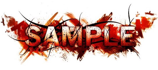
We have started to analysis different typography styles to help us decide what typography we can use for our poster, film magazine cover or website. These are a few examples we found that are quite interesting. The first one we thought could represent our horror film well, it used the three main gothic-horror colours, red white and black. The lettering appears to be on smeared blood, which represents danger, threat, murder, etc. The black lines around the lettering could represent sharp objects such as barbed wire. Eventhough there is a lot of imagery in this style of typography, the word 'sample' is still visable and can be clearly read.
This is the second style of typography we looked at. The lettering is very clear and the bright UV-like colours make it quite eye-catching. However we thought this style wouldn't work as well as the one before because it doesnt represent our particular genre. But the water marks around the lettering create an interestinf effect and we could possibly use this idea and use red to represent blood, danger, threat, etc.
Labels:
Analysis,
Anchorage,
Research,
Typography
Monday, 11 October 2010
Anchorage Ideas
After analyising 'The Grudge' poster and website we looked at the trailer for different anchorage ideas and how to transmit titles into our teaser trailer.
Theses were the first title in The Grudge trailer, it is transmitted through the the visual effects on the screen, it's in the style of the villains hair being whipped across the screen, and this is one of the character's key features. Each letter uses the same affect at a slow pace so the audience has time to read the title.
The whole title isn't visable for the same amount of time, and gripping words have been used such as 'dies' and 'powerful Rage', this gives the audience more information about the narrative.
The second title 'a CURSE is left behind' uses emotive language which creates fear amoung the audience as well as intrigue. By using black anchorage on a white/blue background creates contrasting connotations and mystery which relates to this film being a 'supernatural horror'.
The Next Two Titles:
it never forgives
it never forgets
THE GRUDGE
These next few titles name the villain as 'it' which suggests to the audience that this 'thing' isn't human. The last title is capitalised just to indicate the name of the film and create a dramatic impact. Overal the anchorage used in this particulat trailer has used the same font, size, colour and the same transmissions.
The Orphan Stills
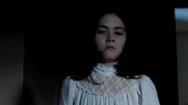
The Orphan is a horror film which uses a young girl as the villain. We thought this particular character was similar to ours.
Her image in this still from the trailer has conflicting connotations. Her white dress indicates innocence and purity however the lighting and her dark features challenge this interpretation. Her facial expression threatens the audience and creates fear as well as intrigue.
We've used simular mise en scene to this for our main character in our teaser trailer to convey the same ideas. We have dressed our character in a white dress which can be perceived as nightwear like in this still.
This still enhances Esther's perceived vulnerability while the distance look on her face creates suspense. We have used a simular location to this in our teaser trailer because it represents a childlike quality and this iw what we wanted to create. Her outfit contrasts with the surroundings and this makes her the focal point in the shot.
In both of these stills, Esther has been deliberately placed in the rule of thirds rather than directly in the middle.
Labels:
Analysis,
Deconstruction,
Research,
Stills,
Trailer
Sunday, 10 October 2010
The Ring - Website Analysis
The Ring has an unusual website design, with the title not being present. The audience can only grasp the film’s title from the bottom right corner, with the trailer link – an image of the distinctive ‘ring’.
The website follows a gothic style colour scheme – the predominant colours being white and black; with the use of a black background leaving a sense of the unknown danger. The audience’s eyes are drawn to the syringe in the centre of the page due to the red shadowing. The hyperlinks at the bottom of the page are also emphasized by the red underlining – which looks as though it has been hand drawn.
The audience is not able to understand the narrative of the film from the website, with the background being just random, eerie objects which leaves a sense of confusion and uncertainty amongst the audience.
The typography has been drawn with the letters being odd sizes, whilst not following an exact straight line. This could bring ideas that the film is different, with unusual consequences.
Once hovering over the hyperlinks, the typography turns red – bringing connotations of blood and death. When the mouse leaves the hyperlink, the font size suddenly increases and the font shakes, creating an unsettling effect.
The Crazies - Website analysis
The trailer is embedded into the website, immediately allowing the audience to grasp the genre and style of the film.
Hyper-links are in white typography, allowing the title ‘The Crazies’ to stand out due to the red typography. In addition, the date of the DVD release is in red. The colour red brings connotations of blood, death and danger – stereotypical of a horror film.
The large, photographically represented image of the sign ‘Welcome to Pierce County Friendliest Place on Earth’ has been transformed into a warning of danger and disturbance. The sign has been attacked with gun shots and ‘Help us’ looks as though it has been scratched in blood. It brings an unsettled era amongst the audience; whilst creating intrigue about what the film entails.
The background is of an isolated area - Isolation = target for victims, with no way of escape. In addition, the weather is dark, gloomy and worrying, adding to the atmosphere of fear.
Nearing the bottom of the website, reviews are given, in the same style font and colour scheme as the hyperlinks and title. It allows the audience to have an insight of what they are to expect if they watch the film – an exciting horror scare, with suspense.
Amongst the black footer, the website advertises the Iphone application –‘The Crazies Tower Defense’. By creating other merchandise, the film has a larger fan base.
Using convergence, the website links up to pages on facebook and twitter; allowing the audience to access information for the film from popular social networking sites.
Friday, 1 October 2010
The Last House on the Left - Sound
A Sound analysis of The Last House on the Left trailer 2009.
http://www.youtube.com/watch?v=sl2lmFPBGN8
- The trailer is introduced with a light-hearted, high pitched, fast paced tone - which is parallel to the imagery ( a friendly road trip).
- The dialogue immediately informs the audience of the storyline and the purpose of their visit - 'Meet up with Page' etc. We are introduced to the main characters of the film and the relationships between the characters.
- The female characters are laughing, creating a happy, relaxed atmosphere; however a sudden low pitched sound stab shows a direct contrast.
- The non-diagetic sound remains parallel - high and low tones blend together to create an eerie sound.
- The dialogue informs the audience of the narrative of the film - we recognise that the characters are in the wrong place and are confronted by unwanted guests. When men are shouting in an aggressive tone, it builds the climax and signals distress.
- The diagetic sound of a knife blade is intimidating and threatening towards the female characters.
- A sudden sound stab as the black screen is introduced.
- As the tempo increases, light drumming is introduced - diagetic screaming, shouting and banging on doors - signals to the audience that the characters can't escape. This is a tactic to build tension.
- A gun-shot brings sudden panic amongst the audience - fear of death and danger.
- As the tempo increases, there are faster, punchy transitions between shots, accompanied with a non-diagetic low pitched banging sound.
- The diagetic sound of rain and wind - weather conditions usually associated with the horror genre.
- Following the climax of the trailer, a non-diagetic melody is introduced - a missing character appears. The soundtrack has lyrics, 'Sweet child of mine..' which could portray how protective the parents are over their daughter.
- Men scream and shout - are represented as the inferior in this situation.
- The climax continues with fast-paced transitions. The low, disturbing non-diagetic sound stops whilst the melody continues into the title of the film.
Wednesday, 29 September 2010
The Exorcism of Emily Rose: Sound
A sound analysis of the first 3 minutes of The Exorcism of Emily Rose.
http://www.youtube.com/watch?v=mVTgk8KEyV0
Throughout titles:
http://www.youtube.com/watch?v=mVTgk8KEyV0
Throughout titles:
- A strong, low monotone at a slow pace.
- A high tone is introduced creating a blend of eerie tones and raising uncertainty amongst the audience.
- The non-diagetic sound is parallel to the narrative - unsettling and hinting the horror genre.
Black Screen:
- The non-diagetic sound continues.
- Diagetic sound is also introduced overlapping the soundtrack - Although not entirely clear what these sounds were, it sounded like wind, animals, screams or someone in pain.
- Is use of dialogue when a female character screams 'Emily?!' - hints danger, pain, distress and lack of power. It specifically intrigues the audience. It seems from the diagetic sound that there is a female protagonist - a stereotypical role of a female in horror film (what is expected ).
Fades to white screen, then imagery is introduced:
- As the title of the film is shown, the screaming stops. Meanwhile the low monotones of the non-diagetic soundtrack are still present.
- Diagetic sounds of howling wind, the rustling of crops and footsteps highlight the silence surrounding the old, male character. It portrays isolation and emphasizes how alone the character is - not safe.
- As the film proceeds, the high non-diagetic tones remain, however when a character feels uneasy, the low tones are re-introduced.
- The sounds of object which are affected by the wind create squeaking, unsettling noises.
- In addition the sound of small animals and wasps hiding for safety indicates a sign of danger. This has raised the tension, and the audience now expects a climax to take place.
- Conversation only starts when the film reaches 3:00 minutes approx, demonstrating that the film has successfully built tension using imagery and sound, showing the audience of the specific codes and conventions of the horror genre.
Tuesday, 21 September 2010
Inception - Front Cover Analysis
- Inception is the main film advertised in Empire magazine, with unique selling point Leonardo DiCaprio in the centre of the cover. Due to Empire being a well known magazine, there is no need for the title to be fully shown.
- At first, the use of red typography hints danger, blood and horror; however the representation of Caprio in a suit brings a sophisticated style. The audience expects fast paced action and a dangerous plot line.
- One of the key features of this front cover is the mention of Christopher Nolan- he is a well known director and has a large fan base following his productions of the Prestige and Batman. This magazine cover reaches out to this audience in particular.
- The reader is immediately focused on the title of the film, due to the capitalised, red typography - It particularly stands out due to the black and white background. The background follows the narrative of the film, as it is a photographically represented image of a city, which is where the film is set, and brings feelings of excitement, exploration and hidden secrets.
- In addition, surrounding Leonardo DiCaprio, are mentions of other blockbuster films. They are slanted and look like they are being pulled back to the centre of the front cover, fitting in with the genres –action, surrealism and deception.
Thursday, 16 September 2010
The Last Exorcism Poster Analysis
-The main colours used in this poster are black, white, grey and red. These are traditionally gothic colours and reference classic horror film posters like 'Nosferatu'. The red stands out against the other dull colours and gives an insight into what the film is likely to include.-The main focus of the poster is the girl, positioned very unnaturally. Her pose links with the narrative of the story, and is reminiscent of the original 'Exorcist' film.
-Another focus of the poster is the film's title. The fact that it is in red means that it stands out against the white background. Red also holds connotations of blood. This mirrors the blood on the girl's white dress, and is an indication that there will be blood in the film.
-The messages of the poster are primarily represented by the image. The fact it is so odd means that it will draw people in and they will want to know more about the film.
-The intended audience for this poster will most definately be fans of horror films, and people over a certain age, probably 15, as for younger members of the public, the image could be quite distressing.
-There are no names of actors on the poster, but Eli Roth's name is prominent above the film's title. Eli Roth is famous for making horror films, and so fans of his previous films (Cabin Fever, Hostel parts I and II) will know that if he is involved, this film will be as good as his earlier work.
-There are religious references on this poster, for example the cross on the wall. It points downwards to the girl and makes sure that the audience focus on her, as her image is the main focus of the poster. The tagline is 'Believe In Him', which refers to God and also gives an insight into themes of the film. The fact that it is about an exorcism confirms that there will be religious references in the film.
-This poster is very effective, predominantly because of the way the girl is positioned. The large stain of blood on her clothes is also shocking, and gives a clear idea of what the film is going to include.
'Let Me In' Poster Analysis
The main colours of this poster are black, red and white; following a gothic style. Red is typically used in horror posters and the colour signifies blood and death .This poster particularly shows the genre by the typography in ‘Me’ - Various shades of red are used and the blood is smudged, creating a realistic effect. In addition, white is used predominantly to emphasise the film title and also creates a sense of the unknown. - The background of the poster is of a cracked, broken mirror, linking to the title of the film – It suggests that an avenger is coming for a victim, however is facing resistance. The mirror also brings an un-nerving presence and therefore intrigues the audience.
- The messages is in this poster are primarily verbal as the title is positioned in the centre of the poster, covering the majority of the space. This is a persuasive technique and stands as a teaser poster as the audience isn’t given any insight to what the film entails.
- A unique selling point is not used; however by mentioning Matt Reeves, director of ‘Cloverfield’, the audience may expect a similar genre. It also brings the suspected audience of the film to be adults due to the danger, violence and death.
Although there is no imagery or tag lines used, this leaves more room for interpretation and therefore stands as an effective poster for the film, making the audience ask questions about the film.
Empire Front Cover Analysis
The main colours used on the front cover here are all typical colours of “the joker”. Your eye is immediately drawn to the photograph and the word “joker on the left side in green, as he is the main focus of the cover.
He is presented as threatening, with the use of make-up, costuming and camera techniques. Most people already know about the iconic joker, so not much information would need to be presented in order to attract readers’ attentions.
The fact that the photo is covering part of the title of the magazine is recognised as being typical of well known magazines, such as “empire”.
The adverts and other features of the magazine are layed out in quite a random order, which could reflect the mind of the joker. Is seems as though it is quite busy, and doesnt follow all the expectations of a typical magazine cover, as there is a large empy gap on the left hand side. The way the words "meet the joker" are written is in a threatening way, as though it is an anonymous letter made with newspaper cuttings. This also has links to the film, as he leaves notes for people throughout the film.
The splodges of random colour over the front cover of the magazine may criminal activity, which also links to the joker's role in the film they are promoting.
Shutter Island Poster Analysis
Dark colours are used in this poster, with the main focus being on the lighted match he is holding. Red is used to highlight the name, and the release date of the film.
The water surrounding the island suggests isolation. The dark water and the rain could reflect dark events that could happen.
The poster mostly conveys ideas visually, with reinforcement through the tag line “someone is missing”. This creates intrigue as it tells you a tiny piece of information about the film.
The eye is drawn to the match, and then down the page to the photographic image, with the title. The actor is recognisable from the photo, but this is reinforced by printing his name above the title, using him as a unique selling point.
As it is quite an ambitious poster, it could suggest that the film has a large budget, and this is reinforced by Leonardo DiCaprio being the lead.
This poster is effective; it engages the audience as they feel familiar with the actor, they know what sort of film they are preparing themselves for, and it communicating well with the audience, telling them the name and the date it will be released.
Tuesday, 7 September 2010
Wednesday, 1 September 2010
Initial Ideas
At the beginning of our coursework we decided to look at two different genres, these were Horror and Romantic Comedy. We compared these two genres to see which one would be more practical to make a teaser trailer.
We also looked at the Benefits and Limitations of these two genres.
Poster Analysis
After considering all aspects of our chosen genres, we decided to contine with Horror and explore it's different sub-genres because we thought it would be more practical and we would be able to create a more successful teaser trailer.
Labels:
Analysis,
Codes and Conventions,
Deconstruction,
Poster
Subscribe to:
Posts (Atom)