Showing posts with label Anchorage. Show all posts

Tuesday, 12 October 2010

Typography Inspiration

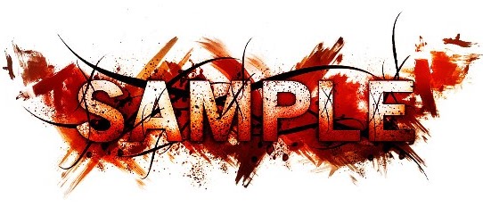
 We have started to analysis different typography styles to help us decide what typography we can use for our poster, film magazine cover or website. These are a few examples we found that are quite interesting. The first one we thought could represent our horror film well, it used the three main gothic-horror colours, red white and black. The lettering appears to be on smeared blood, which represents danger, threat, murder, etc. The black lines around the lettering could represent sharp objects such as barbed wire. Eventhough there is a lot of imagery in this style of typography, the word 'sample' is still visable and can be clearly read.

This is the second style of typography we looked at. The lettering is very clear and the bright UV-like colours make it quite eye-catching. However we thought this style wouldn't work as well as the one before because it doesnt represent our particular genre. But the water marks around the lettering create an interestinf effect and we could possibly use this idea and use red to represent blood, danger, threat, etc.

Monday, 11 October 2010

Anchorage Ideas

After analyising 'The Grudge' poster and website we looked at the trailer for different anchorage ideas and how to transmit titles into our teaser trailer.


Theses were the first title in The Grudge trailer, it is transmitted through the the visual effects on the screen, it's in the style of the villains hair being whipped across the screen, and this is one of the character's key features. Each letter uses the same affect at a slow pace so the audience has time to read the title.
The whole title isn't visable for the same amount of time, and gripping words have been used such as 'dies' and 'powerful Rage', this gives the audience more information about the narrative.

The second title 'a CURSE is left behind' uses emotive language which creates fear amoung the audience as well as intrigue. By using black anchorage on a white/blue background creates contrasting connotations and mystery which relates to this film being a 'supernatural horror'.

The Next Two Titles:

it never forgives

it never forgets

THE GRUDGE

These next few titles name the villain as 'it' which suggests to the audience that this 'thing' isn't human. The last title is capitalised just to indicate the name of the film and create a dramatic impact. Overal the anchorage used in this particulat trailer has used the same font, size, colour and the same transmissions.