Showing posts with label Deconstruction. Show all posts

Monday, 11 October 2010

The Orphan Stills

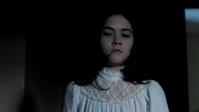
The Orphan is a horror film which uses a young girl as the villain. We thought this particular character was similar to ours.
Her image in this still from the trailer has conflicting connotations. Her white dress indicates innocence and purity however the lighting and her dark features challenge this interpretation. Her facial expression threatens the audience and creates fear as well as intrigue.
We've used simular mise en scene to this for our main character in our teaser trailer to convey the same ideas. We have dressed our character in a white dress which can be perceived as nightwear like in this still.


This still enhances Esther's perceived vulnerability while the distance look on her face creates suspense. We have used a simular location to this in our teaser trailer because it represents a childlike quality and this iw what we wanted to create. Her outfit contrasts with the surroundings and this makes her the focal point in the shot.

In both of these stills, Esther has been deliberately placed in the rule of thirds rather than directly in the middle.

Wednesday, 8 September 2010

What Lies Beneath - Poster Deconstruction

  • The photographically represented image of the hand grabbing on to bath edge, indicates the horror genre, hinting revenge and return. It also links to the larger font of ‘Lies’ as the hand is reaching up, from beneath and the unknown. Pragmatically, the larger font of ‘Lies’ could have a second meaning, hinting that the family environment was built on lies and there is a consequence.
  • Focusing on the image, water signifies vulnerability and danger in the horror genre; shadow and darkness signifies hidden secrets and the unknown. Horror posters stereotypically use haunting, intimidating colours such as black or red, therefore it is unusual to use the colour white.  The white and stark background highlights the image and the simplistic title.
  • Tag line - ‘He was the perfect husband until his one mistake followed them home’ doesn’t give away the narrative, however informs the reader that the film develops into a shocking and disturbing plot, from a perfectly average family. Its purpose is to intrigue the audience and entice them to view the film, standing as a persuasive technique.
  • Unique selling point – Harrison Ford is popular Hollywood actor, therefore the film producers would expect that the film would be popular with his fan base and specific target audience of action and violence.

The Prestige - Comparison between Theatrical and Teaser Trailer


Theatrical trailer – 2:35 minutes http://www.youtube.com/watch?v=xPyVBO2rRyg
  • The Audience is able to understand the relationship between the main characters – the film is shown to be a battle between magicians.
  • Informs the audience of the reasoning behind the film title ‘The Prestige’.
  • It introduces the trailer with a dangerous magic trick, immediately focusing the attention of the audience.
  • Text/anchorage – ‘A Friendship that became a Rivalry’ ‘A Rivalry that became a Battle’. Highlights the general plot of the film, allowing the audience to know what to expect. Whilst clearly demonstrating the developing plot of the film and the changing relationship between the magicians.
  • Mentioning the directors previous success’s ‘Batman’ and ‘Momento’ suggests that this upcoming film will follow a similar style and genre – the audience may therefore expect this film to contain action and occasions of violence.
  • Non-diagetic sound develops as the plot and the battle thickens.
  • The end of the trailer has a fast paced style, specifically showing the last half of the film, appealing to the audience. There is a sudden increase of non-diagetic sound as the action increases, followed by sudden silence.
  • ‘Secrets are my life’ – showing the changed relationship between the magicians. Also the distress shown by the wife illustrates the changes nature of the magician.
  • Trailer shows the transformation of a light-hearted competition into a violent battle. 


    Teaser trailer – 1:01 minutes
    • Informs the reader of the changing relationship between the magicians, however doesn’t explain why – hence intriguing the audience.
    • Still much of the narrative shown – can suggest that this is because it is a ‘new’ film – the target audience has no expectations of the film as it isn’t a sequel or known narrative. The teaser trailer demonstrates the main outline of the plot.
    • Similar text to the theatrical trailer, but doesn’t show the meaning behind the title ‘The Prestige’ and the importance of a magicians trick.
    • There are fast paced transitions between shots, specifically showing the audience the main characters and their role in the film.
    • ‘He can do what magicians pretend to do’ – said between the pause of loud non-diagetic sounds, emphasised in the silence. Teases the audience – they want to know the reason between the rivalry and how the magicians rival each other.

    Sherlock Holmes - Front Cover Deconstruction

    • Holmes is represented as the dominant male, intimidating and violent; as depicted by his stern facial expressions and the cuts on his face and hands. In addition, the character is positioned in the centre of the page, with small advertisements surrounding him – he is the main focus, and his beady eyes particularly hint threat, confidence and anger.
    • His character positioning creates intrigue amongst the audience, as Holmes looks like he is planning something (as hinted by his hands).
    • Due to Sherlock Holmes being portrayed in a ‘rough, tough’ way; one would assume that the film is purposely created for adults and older children, due to the connotations of violence and danger.
    • Sherlock Holmes is a well known narrative, therefore the film creators have a desired target audience – he is known as the ‘world’s greatest detective’. By creating a different slant, or ‘rebirth’ of the story; portraying Holmes in a contrasting way; the audience are appealed to watching the film. It stands as a teaser, as the audience are intrigued about the ‘new’ version of Holmes.
    • The title ‘Sherlock Holmes’ is striking due to its capitalisation, its position in the middle of the page, and the contrasting colours to his costuming.

    Sherlock Holmes - Poster Deconstruction

    • Anchorage – ‘Nothing escapes him’. There to create intrigue amongst the audience. It aids the understanding of the picture as Holmes is the main focus, demonstrating him as the superior position in the film.
    • The main figure photographically represented in this poster is Sherlock Holmes, with the blurred, frosted images of London city in the background, highlighting Holmes’ dominance in the city.
    • The Big Ben and the Tower of London lie in the backdrop of the poster, which are iconic and traditional buildings of London City, informing the audience of where the story is set and what they are to expect – Connotations of London in the times Holmes is set bring connotations of dirty streets, the black market, theft and violence.
    • The poster uses black, white and blue vivid colours, portraying an eerie tone. It gives a specific impression that the film was set in a grimy, crime ridden London. The different slant of the traditional narrative is shown by these dark, gloomy colours, and this could effectively be a persuasive technique.
    • Holmes is represented as an intimidating character; however by focusing on his facial expressions. He shows slight humour and confidence; appealing to the audience.
    • Robert Downey JR stands as a unique selling point, and the film company would have cast him to appeal to this particular target audience and his current fan base. 

    Thursday, 2 September 2010

    Trailer Deconstructions

    The Last House on the Left

    http://www.youtube.com/watch?v=JqfDli2QCuY

    Sound – starts with peaceful music, as there is little chaos. A sound stab quickly changes this when the mood changes, and ominous strings are introduced. Sounds linking to violence such as punching are enhanced. When there is dialogue, there is no music as the audience is expected to concentrate on the things being said. Later, there is a contrapuntal score, which uses a more peaceful remake of a rock song.

    Camera – Lots of close ups to clearly show fear and characters emotions. Low/high angle to convey dominance. Two shots show close friendship, causing the audience to empathise with the characters.

    Mise en Scene – Different lighting is used throughout the trailer to create different moods e.g. orange in the bedroom, to create a warm, homely feeling. Lots of shadowy lighting, with just faces illuminated illustrates terror. Girls wear bright, feminine, floral clothes which suggest innocence and vulnerability, but the “baddies” all wear dark clothes to reflect their dark personalities and purposes in the film.
    Editing – Quick shot changes show how quickly the mood changes. Black screens are used so the audience concentrates on the sound, and also creates an ominous feeling.


    Sex and the City 2

    http://www.youtube.com/watch?v=XKQ5yRFkBnE

    Sound – The usage of a well known song ‘New York’ by Alisha Keys appeals to the target audience and informs us of the films’ location. The voice over used introduces us the main character but also doesn’t give any of the plot away. Quotes such as ‘You haven’t seen anything yet’ and ‘sometimes you’ve gotta get away with the girls’ creates intrigue and excitement. Recognisable theme tune from the series and first film reminds the audience that this will be similar.

    Camera – Flashes of New York City mixed with titles are used at the beginning this represents the glamorous life styles of New York. The Mid-shots of all the characters show their busy lives, the long shots of a wedding and close-ups of couples indicate romance. The Editing at the beginning and end are particularly quick attracting the audience’s attention.

    Mise en Scene – Different characters have different colour schemes and stick to these throughout. This allows the audience to relate to the characters. Glamorous feel e.g. sparkling logo, luxurious settings, amazing clothes.

    Editing – Jumpy editing is used throughout to emphasise the speed of their modern lifestyles. The three different shots placed of the screen show how big the city is and reflects their lives. The straight cuts show how different their lives are but the shot of them all at the end shows they are all still friends. Careful editing shows various settings but doesn’t reveal much narrative

    Wednesday, 1 September 2010

    Initial Ideas

    At the beginning of our coursework we decided to look at two different genres, these were Horror and Romantic Comedy. We compared these two genres to see which one would be more practical to make a teaser trailer.

    We also looked at the Benefits and Limitations of these two genres.


    Poster Analysis


    After considering all aspects of our chosen genres, we decided to contine with Horror and explore it's different sub-genres because we thought it would be more practical and we would be able to create a more successful teaser trailer.