Showing posts with label Typography. Show all posts

Sunday, 28 November 2010

Typography development

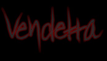
As we created are own style of typography; we wanted to experiment with different shades of colour to create a title which instantly stands out. We focussed on using the colour red due to the connotations of blood, death and fear; keeping to the genre of supernatural horror. Using Serif Draw Plus, the software enabled us to adjust the bightness and contrast of the lettering, whilst also having a darkened border aroung the individual letters to create a 3D effect. We came to the conclusion that the darkened shades of red created a more threatening and un-nerving impression on the audience, therefore we kept to this style. We did attempt using a darker colour of grey, however it didn't keep the same glow effect as the lighter reds.
By exprimentating with the using of tag lines in a simplistic, white typograpghy; we presented a gothic style of colour. Both the red and white typograpghy stood out against the stark black background, which emphsized the supernatural horror genre.

Sunday, 21 November 2010

Typography for our film title


http://www.searchfreefonts.com So far we have created our typography individually using our own software - For a change I researched font styles which would suit our particular genre of supernatural horror and revenge. The results show a great diversity between fonts and the impact it may have on the audience. In particular, I think that the most effective font style for our narrative our those which look handwritten. They could create an unsettling atmosphere along with the combined efforts of the background and imagery on the poster.

Thursday, 11 November 2010

Typography Experimentation


By using Adobe Photoshop, I was able to type along the path of an individual letter. This style can be developed by using a range of colours linked specifically to our genre, and by using a whole word, e.g. the title of our film.


Similarly, this experimentation of typography layout shows that text can follow a shape. We can use this idea in our ancillary tasks - the title can follow imagery. By using different font sizes, there are points of the image which the audience specifically focus' on. We could, therefore include larger font size over the golden section of our poster to attract attention.


This draft title was created using Serif Drawplus 8.0. The red typography immediately signifies danger and blood, hence linking to our genre. However, we could develop this and use a colour which specifically links to our supernatural genre - such as a murky green. The colour is enhanced when positioned in front of a black background, therefore this is a key feature of our poster and website. By have a handwritten style font and using the node tool to alter the style of font, the result is an unsettling and appealing title for our film.


This was creating also using Serif Drawplus 8.0, whereas I used one of our photographs to act as the main feature of our poster, with the typography positioned to create an idea of a finished product. The font and image both portray the horror genre. It seems that the audience is more focused on the title when it is positioned in front of a stark background, without imagery. We will incorporate this idea into the drafts of our ancillary tasks.


Tuesday, 12 October 2010

Typography in posters

The poster of ‘When a Stranger calls’ have opted for a simple style of typography, ensuring that it is clear for the audience.


The colour scheme of the title follows the colours shown in the imagery, with the colour being drained from the text the further away it is from the imagery, creating a faded effect. Compared to other horror films, yellow is a prominent colour, with its purpose to highlight the darkness of the film and portray an unsettling narrative.

The title is positioned in the top, centre of the poster, where the eye naturally settles on the page. It is emphasized due to the use of a stark black background.

It is a not typical of a horror film, but the emotionless typography with serif font brings a sense of the unknown, consequently intriguing the audience.


The font used for ‘disturbia’ resembles type-writer font, as it is simple and clear.

The colour of the typography is white, and is emphasized by the black background. The use of a black and white background means that the audience is immediately drawn to the coloured imagery.

The tag line used is in very small font, forcing the audience to try and make out what it says, focusing strongly on the poster. In addition, the title and the tag line have the same font style, with purpose to relate to the film.

The style of font is also emotionless – where by the audience is not able to grasp the horror genre by the title. Due to its simplicity, it leaves a sense of the unknown, leaving the audience questioning.

In this poster, the imagery is a stronger persuasive technique than the title – due to the titles size and positioning. It is positioned just below the image, and stands out, making it clear for the audience.

Typography Examples

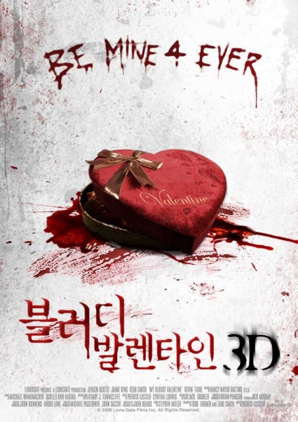
This text looks like its written in blood, but also has a scratchy style to the lettering. The number “4” could relate to a younger target audience, as it is "text" language. The red colour represents blood, death etc but is also challenged by the image of a heart as it represents romance, but has blood underneath. It also says valentine on the heart (box of chocolates) The audience quite a lot of narrative from the poster, could possibly be obsession. Also the language used at the bottom creates intrigue, but is written in the same way as the title.


Although this doesn't fit the genre of our teaser trailer, the typography used is interesting. The title is very clear and simple to read. It is also the first thing that the eye is drawn towards, and it is in the golden section. The colour of the typography changes through the word depending, and contrasting with the background. The black and white colouring could repestent conflict between the characters. The woman standing in the back is wearing a red dress, which comes with all the connotations of being seductive, promiscuous, and sexually dominant, and could be the character to be feared or disliked in the film.
We really like this example of typography, as the lettering and whole words are still very clear and easy to read, but also has a hidden message. When you look closely, the audience can see that the shape of a corner of a shower is shown in the lettering, and as it gets closer to the bottom the amount of red blood increases.  It uses the 3 gothic colours, red white and black. At the beginning the audience are attracted to the blood at the bottom, but they have to really focus to see what it is, which creates intrigue about the event.
All of these examples of typography could influence our decisions made when creating our typography.

Typography Inspiration

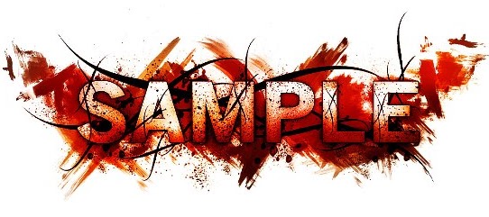
 We have started to analysis different typography styles to help us decide what typography we can use for our poster, film magazine cover or website. These are a few examples we found that are quite interesting. The first one we thought could represent our horror film well, it used the three main gothic-horror colours, red white and black. The lettering appears to be on smeared blood, which represents danger, threat, murder, etc. The black lines around the lettering could represent sharp objects such as barbed wire. Eventhough there is a lot of imagery in this style of typography, the word 'sample' is still visable and can be clearly read.

This is the second style of typography we looked at. The lettering is very clear and the bright UV-like colours make it quite eye-catching. However we thought this style wouldn't work as well as the one before because it doesnt represent our particular genre. But the water marks around the lettering create an interestinf effect and we could possibly use this idea and use red to represent blood, danger, threat, etc.