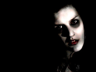
For our ancillary tasks we wanted out villain to be the main focus, especially in the poster. We felt it was more effective to use a scary image to persuade our target audience to see the film. Whilst filming for our teaser trailer we were able to take photos of our villain in the dark, which was an appropriate background.
This was one of the many photos we took with a possibility of being used for our poster or website. The expression on her face could be quite intimidating and scary with the right editing. She is looking directly at the camera and therefor at the audience.
These two photos were edited from the original above. The reason for using red and green was to signify different codes and conventions of a horror film. The red one uses the three gothic colours, red, black and white, and represents blood, murder and is a typical convention of a horror film.
However, the green picture represents our super natural sub-genre and well as jealousy which is part of our narrative.
After consideration, we decided that these pictures faded into the background too much and didnt stand out as much as they should do for a poster, however the angle and expression of the face it really interesting and works well for either a poster of as an image for a website.
This was our final edit of this particular photo and found that is was far more effective than the others. The features of the face are far more defined, it uses the three gothic colours again and the pale white skin and dark eyes help the face stand out. The character looks more intimidating and scary.


No comments:
Post a Comment