Tuesday, 1 February 2011

Poster designs


This poster design specifically uses the style of Gothic colouring. Through editing, we were able to adjust the image of the villain to shades of black and white, combined with a bright glow which enhances the white against the darkness. The decision to colour match her lips to the title created a striking design, with the shades of red  standing as the main focus, also bringing the eye-line of the audience towards the smaller tag line at the bottom centre of the poster. We focused the rule of three by positioning half the villain's face on the far left of the design. The audience hence instantly focuses on the unsettling, red typography in the centre - the golden section.


Contrasting the previous poster in terms of colouring, positioning and use of image, this poster design adopts codes and conventions of the supernatural horror genre, without using bright colours. However, we concluded that the audience needs a main focus, usually shown by a colour - this poster uses darker, dull colours which doesn't give the same scary effect. By using a moving image of the villain confronting the audience, it creates a threatening and intimidating atmosphere, attracting the audience to watching the film. The golden section of this poster is focussed on the glowing image of the villain, due to its position against the black background. The audience's eye-line continues upwards towards the title due to the central positioning of the tag line and main title of the film.

Similar to the first poster design, this also follows a Gothic colour style - a typical code and convention of horror film posters. Differently, we adjusted the colour of typography to a light, brilliant red and increased the size so it was a more imposing feature of the poster. The audience will naturally focus on the eerie, glowing image of the villain due to her emotionless facial expressions and defined eyes. The tag line was positioned  on the eye-line of the villain so the audience looks at the text instantly.

We made the decision to have green as the predominant colour, suiting to the supernatural genre. The dark, grimy colour is an imposing feature of the poster, fading into the black background. The landscape setup combined with the image positioned to the left of the poster, following the rule of three, instantly attracts the attention of the audience. Her tilted stance is un-nerving and creepy, creating fear amongst the audience. The typography remains a deep red with a green, glowing border however against the black background, the title doesn't stand out as effectively as the bolder colours.
By changing the main colour of the typography to a brilliant white, the title is more imposing; however the poster doesn't particularly link to the supernatural horror. The thin, green border surrounding the lettering is less effective as the typography sits plain and 2 dimensional. We concluded that the combination of red, white and black creates more fear and connotes death and horror instantly, in comparison  to green.

Saturday, 18 December 2010

Photography for Ancillary Tasks

For our ancillary tasks we wanted out villain to be the main focus, especially in the poster. We felt it was more effective to use a scary image to persuade our target audience to see the film. Whilst filming for our teaser trailer we were able to take photos of our villain in the dark, which was an appropriate background.

This was one of the many photos we took with a possibility of being used for our poster or website. The expression on her face could be quite intimidating and scary with the right editing. She is looking directly at the camera and therefor at the audience.

These two photos were edited from the original above. The reason for using red and green was to signify different codes and conventions of a horror film. The red one uses the three gothic colours, red, black and white, and represents blood, murder and is a typical convention of a horror film.
However, the green picture represents our super natural sub-genre and well as jealousy which is part of our narrative.
After consideration, we decided that these pictures faded into the background too much and didnt stand out as much as they should do for a poster, however the angle and expression of the face it really interesting and works well for either a poster of as an image for  a website.
This was our final edit of this particular photo and found that is was far more effective than the others. The features of the face are far more defined, it uses the three gothic colours again and the pale white skin and dark eyes help the face stand out. The character looks more intimidating and scary.

Sunday, 28 November 2010

Typography development

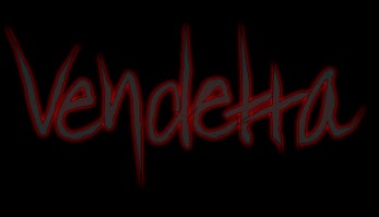
As we created are own style of typography; we wanted to experiment with different shades of colour to create a title which instantly stands out. We focussed on using the colour red due to the connotations of blood, death and fear; keeping to the genre of supernatural horror. Using Serif Draw Plus, the software enabled us to adjust the bightness and contrast of the lettering, whilst also having a darkened border aroung the individual letters to create a 3D effect. We came to the conclusion that the darkened shades of red created a more threatening and un-nerving impression on the audience, therefore we kept to this style. We did attempt using a darker colour of grey, however it didn't keep the same glow effect as the lighter reds.
By exprimentating with the using of tag lines in a simplistic, white typograpghy; we presented a gothic style of colour. Both the red and white typograpghy stood out against the stark black background, which emphsized the supernatural horror genre.

Sunday, 21 November 2010

Typography for our film title


http://www.searchfreefonts.com So far we have created our typography individually using our own software - For a change I researched font styles which would suit our particular genre of supernatural horror and revenge. The results show a great diversity between fonts and the impact it may have on the audience. In particular, I think that the most effective font style for our narrative our those which look handwritten. They could create an unsettling atmosphere along with the combined efforts of the background and imagery on the poster.

Thursday, 11 November 2010

Typography Experimentation


By using Adobe Photoshop, I was able to type along the path of an individual letter. This style can be developed by using a range of colours linked specifically to our genre, and by using a whole word, e.g. the title of our film.


Similarly, this experimentation of typography layout shows that text can follow a shape. We can use this idea in our ancillary tasks - the title can follow imagery. By using different font sizes, there are points of the image which the audience specifically focus' on. We could, therefore include larger font size over the golden section of our poster to attract attention.


This draft title was created using Serif Drawplus 8.0. The red typography immediately signifies danger and blood, hence linking to our genre. However, we could develop this and use a colour which specifically links to our supernatural genre - such as a murky green. The colour is enhanced when positioned in front of a black background, therefore this is a key feature of our poster and website. By have a handwritten style font and using the node tool to alter the style of font, the result is an unsettling and appealing title for our film.


This was creating also using Serif Drawplus 8.0, whereas I used one of our photographs to act as the main feature of our poster, with the typography positioned to create an idea of a finished product. The font and image both portray the horror genre. It seems that the audience is more focused on the title when it is positioned in front of a stark background, without imagery. We will incorporate this idea into the drafts of our ancillary tasks.


Typography

For our teaser trailer, poster and website we need the title of our film to catch the audience's eye, be exciting and stand out. It also needs to represent our choice of genre and link in with our main character. Here is some experimentation:

This typography was made on a software called Serif Drawplus 8. I used an original font then modified it by dragging the edges of each letter into a point. I think this worked well as it could be portrayed as childlike because of the way it has been written, however, the sharp edges of each letter represents our selection genre well as it shows danger and threat. We all decided we liked this font the most so we used it as a template.

I then added a green glow to the same typography and this linked to our supernatural sub-genre. We feel that the right message is beginning to be portrayed. At the beginning we looked at having both black and white backgrounds to see which looked better, here i feel a black background would emphasise our chosen genre and white doesn't portray the right message.

I changed the background colour to black because i feel it represents our type of horror better than white would. I changed the colour of typography to white and used the same effect as the typography before. Unfortunately it didn't come across in the same way, however the colour is particularly effective and catches the audience's eye immediately.
We thought that this font reminded us too much of 'The Hulk' and doesn't portray the right message.