Sunday, 28 November 2010

Typography development

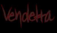
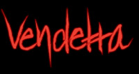
As we created are own style of typography; we wanted to experiment with different shades of colour to create a title which instantly stands out. We focussed on using the colour red due to the connotations of blood, death and fear; keeping to the genre of supernatural horror. Using Serif Draw Plus, the software enabled us to adjust the bightness and contrast of the lettering, whilst also having a darkened border aroung the individual letters to create a 3D effect. We came to the conclusion that the darkened shades of red created a more threatening and un-nerving impression on the audience, therefore we kept to this style. We did attempt using a darker colour of grey, however it didn't keep the same glow effect as the lighter reds.
By exprimentating with the using of tag lines in a simplistic, white typograpghy; we presented a gothic style of colour. Both the red and white typograpghy stood out against the stark black background, which emphsized the supernatural horror genre.

Sunday, 21 November 2010

Typography for our film title


http://www.searchfreefonts.com So far we have created our typography individually using our own software - For a change I researched font styles which would suit our particular genre of supernatural horror and revenge. The results show a great diversity between fonts and the impact it may have on the audience. In particular, I think that the most effective font style for our narrative our those which look handwritten. They could create an unsettling atmosphere along with the combined efforts of the background and imagery on the poster.

Thursday, 11 November 2010

Typography Experimentation


By using Adobe Photoshop, I was able to type along the path of an individual letter. This style can be developed by using a range of colours linked specifically to our genre, and by using a whole word, e.g. the title of our film.


Similarly, this experimentation of typography layout shows that text can follow a shape. We can use this idea in our ancillary tasks - the title can follow imagery. By using different font sizes, there are points of the image which the audience specifically focus' on. We could, therefore include larger font size over the golden section of our poster to attract attention.


This draft title was created using Serif Drawplus 8.0. The red typography immediately signifies danger and blood, hence linking to our genre. However, we could develop this and use a colour which specifically links to our supernatural genre - such as a murky green. The colour is enhanced when positioned in front of a black background, therefore this is a key feature of our poster and website. By have a handwritten style font and using the node tool to alter the style of font, the result is an unsettling and appealing title for our film.


This was creating also using Serif Drawplus 8.0, whereas I used one of our photographs to act as the main feature of our poster, with the typography positioned to create an idea of a finished product. The font and image both portray the horror genre. It seems that the audience is more focused on the title when it is positioned in front of a stark background, without imagery. We will incorporate this idea into the drafts of our ancillary tasks.


Typography

For our teaser trailer, poster and website we need the title of our film to catch the audience's eye, be exciting and stand out. It also needs to represent our choice of genre and link in with our main character. Here is some experimentation:

This typography was made on a software called Serif Drawplus 8. I used an original font then modified it by dragging the edges of each letter into a point. I think this worked well as it could be portrayed as childlike because of the way it has been written, however, the sharp edges of each letter represents our selection genre well as it shows danger and threat. We all decided we liked this font the most so we used it as a template.

I then added a green glow to the same typography and this linked to our supernatural sub-genre. We feel that the right message is beginning to be portrayed. At the beginning we looked at having both black and white backgrounds to see which looked better, here i feel a black background would emphasise our chosen genre and white doesn't portray the right message.

I changed the background colour to black because i feel it represents our type of horror better than white would. I changed the colour of typography to white and used the same effect as the typography before. Unfortunately it didn't come across in the same way, however the colour is particularly effective and catches the audience's eye immediately.
We thought that this font reminded us too much of 'The Hulk' and doesn't portray the right message.


Friday, 5 November 2010

Poster and Website designs

 Website initial ideas: Here are the original annotated designs of our website, promoting the film 'Vendetta'. After the research and gathering opinions of current film websites, we focussed on designs which would represent the villain as a menacing, supernatural being, whilst also keeping a user-friendly interface.

Poster initial ideas: Similarly to the website, our main focus was to attract the audience and create a teaser poster through the fearful representation of the villain. We also included designs with the protagonist the main focus, forcing the audience to empathise with the powerlessness of the victim. Here are the annotated  designs.

Thursday, 4 November 2010

The Dark Knight - Website Analysis

 
 As the website loads, this appears on the screen. Although the colours/font used could link to the film, it doesn't hold the visitors attention. The website does take a while to load due to the complex graphics and animations, which could also lose the users attention. We would aim for this not to be the case on our website, as we would try to keep it simple to keep loading times to a minimum.

This front page of the website has the trailer playing, and the film that is "now available on blu-ray and dvd" clearly shown. It is clear and user friendly as all the links such as "enter the site" are on screen, without having to scroll down. 


If you click to enter the website, this is the next page that appears. The background image links to the film without distracting the user too much from the links, the dvd and any other information on the website. The menu that appears at the bottom has a button that you click to show all of the different options. The colours use link to the film well, and the text is clear to read. Other information such as the director, age rating etc are written at the bottom of the webpage, but the user would need to scroll down to see these. This is effective as it does not remove anything from the main part of the website, but still has any extra information clealy demonstrated.

Wednesday, 3 November 2010

Quarantine Website Analysis

The first screen from the Quarantine website has a link to buy the DVD and Blu-Ray. The image in the background is of the main character looking scared, edited to seem as if it has been captured through CCTV footage, which reflects the general nature of the film. The trailer takes up a significant portion of the screen, which will immediately draw people's attention to it. It plays automatically which increases the ease of use. There are links to photos, a game and a blog, among other things, which caters for everyone's interests.


The loading page for the website is the footage from the last clip in the trailer, played on a loop. This keeps the audiences attention and is much more interesting than just a black screen with a loading bar at the bottom. Once the page has loaded, the woman is dragged away and this is designed to shock people and to give an insight into the tense and scary nature of the film. For our own website, we are interested in playing an animation, because it will allow the audience to gain an insight into the genre and themes of our film, and offers a more interesting way to wait.


Once onto the main site, link options are displayed as soon as the mouse hovers over different sections. These include; video,  gallery, game, about the movie, promotions, downloads and social networking. These links are set on the backdrop of the profile image of an apartment complex, which is where the film is set. The image itself is creepy, with the inclusion of flickering lights and fuzzy TV screens. The idea of hovering over something for it to appear is quite interesting and would be good to include, but it should be made obvious where to look for the different options, or it will decrease the ease of use.